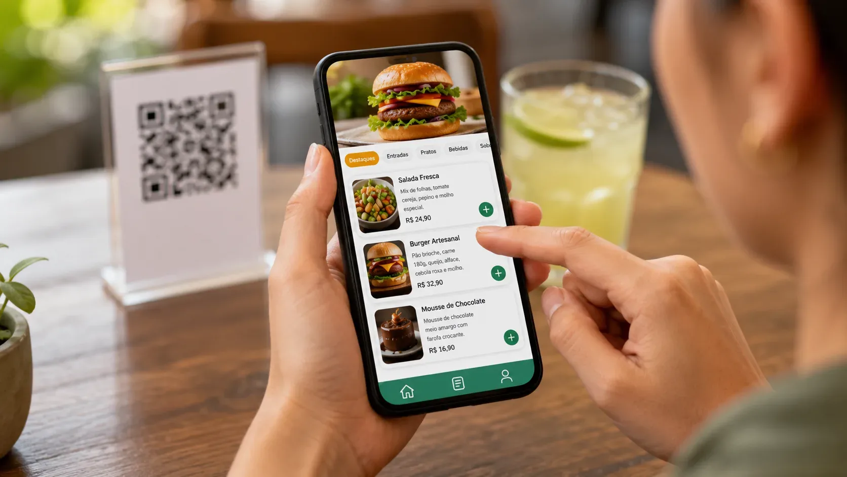
A menu can open quickly using the QR Code and still make it difficult to choose. Small text, poor contrast, confusing categories, hard-to-touch buttons or information placed only within images are barriers that appear just when the customer needs to decide what to order.
The good news is that most of these problems can be identified with simple tests. The checks below were translated from WCAG 2.2 criteria and digital accessibility guidelines into a routine that the establishment itself can perform. They serve to find problems and guide corrections, but they are not equivalent to a certification of compliance: the W3C states that automatic tools cannot alone determine whether a website meets accessibility standards and that human evaluation remains necessary.
Before testing, use the menu that the customer actually receives
Do not just perform the evaluation within the administrative panel or on the preview screen. Open the public address using the same path as the customer: QR Code or link, cell phone browser and, preferably, more than one device.
This logic fits well with solutions where the menu is a public page.  , available at menu.biomi.space, offers a menu consulted via the browser, without requiring an account from the customer, and allows you to organize categories, products, photos, prices and descriptions. The establishment can also choose between consultation only, creating a list for WhatsApp or a simple command panel.
Biomi itself informs that its public page and panel have been adjusted for smaller screens. That's a good starting point, but responsiveness and accessibility aren't exactly the same thing. After registering the actual menu, it is still important to check how texts, images, categories and actions behave in practice.
1. Enlarge text to 200%
Open the menu in the browser and increase the zoom or text size until it reaches approximately 200%.
Then scroll through categories, dish names, descriptions, prices and buttons. The content must remain available and usable, without cut-off texts, overlapping elements or disappearing functions.
WCAG 2.2 criterion 1.4.4 establishes that, with the exceptions provided for in the standard, the text must be able to be resized up to 200% without loss of content or functionality.
Approved: everything is still readable and usable.
Review: price disappears, description is cut off, button is hidden or part of the menu stops working.
2. See if the page continues to work in a narrow area
Test on a small screen or greatly increase the content until you reduce the usable area of the page. Note whether you need to move the screen left and right to finish reading a product.
WCAG 2.2 addresses this behavior in the reflow criteria: in vertically scrolling content, the reference is a width equivalent to 320 CSS pixels, without loss of information or functionality and, under normal conditions, without requiring scrolling in two dimensions.
On a menu, this is especially important because names, descriptions, prices, and controls often appear together.
Approved: the page reorganizes vertically.
Review: customer needs to drag sideways to read prices, descriptions or access commands.
3. Check the contrast between text and background
Note the product name, description, price, categories, warnings and texts inside the buttons.
WCAG 2.2 adopts, at level AA, a minimum contrast ratio of 4.5:1 for regular text and 3:1 for text considered large, with the exceptions provided for in the criteria.
Don’t try to decide just “by eye”. A combination may appear readable to the person who created the layout and still be insufficient to someone else. Use a contrast checker to measure key combinations.
Passed: combinations meet applicable values.
Review: light texts appear on light backgrounds, or dark texts lose definition on images and dark areas.
4. Mentally turn off the colors: does the information still make sense?
Imagine that the customer cannot distinguish the color used to indicate “available”, “selected”, “featured” or a certain category.
WCAG determines that color is not the only visual resource used to convey information, indicate an action or differentiate an element.
If an unavailable item is indicated by just turning gray, for example, add a textual indication. If an active category depends solely on another color, also evaluate shape, marking, or text.
Approved: the information remains understandable without depending solely on color.
Review: removing the color difference makes the customer lose the meaning.
5. Make sure prices and important information are in real text
Photos make the menu more visual, but they should not alone carry the name, price, ingredients or other information necessary to choose.
WCAG recommends avoiding images of text when the same presentation can be produced with real text, precisely because the user may need to change size, colors, font, spacing or other presentation characteristics.
Therefore, a banner with “combo R$ 29.90” should not be the only source of this information. The relevant value and conditions must also appear as textual content.
Approved: the customer understands the product and price even without interpreting the text embedded in the images.
Review: promotions, prices or conditions only exist within banners and photographs.
6. Browse the categories like someone who doesn't know the menu yet
Read only the category names and try to quickly locate a type of product: drink, dessert, burger, main dish or side dish.
Titles and labels must describe their subject or purpose in accordance with WCAG criteria 2.4.6.
“Drinks” provides better guidance than a category called just “Other”. “Combos” works when you actually group combinations together. The organization must reflect the way the customer searches, not just the internal structure of the establishment.
On Biomi Menu, the public page provides organization by categories and display of products with name, price and description, which allows this type of structure to be applied directly to the menu.
Passed: a person who has never seen the menu understands where to look.
Review: categories overlap, use internal names, or force the customer to open multiple options per attempt.
7. Try touching the controls without precision
Use just one hand and tap categories, add buttons, quantity controls or other interactive elements as normal.
In WCAG 2.2, criterion 2.5.8 establishes, at level AA, a minimum reference of 24 by 24 CSS pixels for pointer targets, with exceptions provided for by the standard itself, including situations related to spacing.
For the restaurant owner, the simplest assessment is practical: the buttons need to be easy to hit and sufficiently separated so as not to cause touching the neighboring control.
Passed: controls can be operated without effort or frequent accidental touches.
Review: Small links and buttons are cluttered, especially on the sides of the screen.
8. Place the order without using the mouse
Also open the menu on a computer and try to navigate using only the keyboard: Tab, Shift+Tab, Enter, space bar and arrows when appropriate.
eMAG advises that manual validation includes navigating the page only with the keyboard and, when possible, with assistive technologies. WCAG also contains specific criteria for keyboard operation.
Note two things: whether you can reach the elements and whether it is visually clear where the focus is.
Approved: important categories, links and actions can be reached and acted upon.
Review: the focus disappears, skips important controls or gets stuck in a component.
9. Use your phone in portrait and landscape
Rotate the device and check the menu again.
The goal is not to require everyone to use both positions, but to identify layouts that only work in one orientation and hide information when the device is rotated. WCAG 2.2 includes screen orientation among its adaptability criteria.
Pay attention especially to horizontal categories, modals, carts, and sticky buttons.
Approved: content remains usable in supported orientations without undue loss.
Review: Prices, controls, or product parts disappear after rotation.
10. Check out what happens when photos don't help
Analyze each product image by asking: “If this photo cannot be seen, does the customer still receive the information they need?”
WCAG requires a textual alternative for non-textual content when it needs to fulfill an equivalent purpose.
On a menu, the name and description of the dish can already provide much of the context. The image's alternative text must have a real function, and not mechanically repeat everything that is already around it.
Approved: removing the photograph does not prevent identifying the item or understanding necessary information.
Review: the image contains essential information that does not appear in any other accessible way.
11. Take a pass with a screen reader
Activate a screen reader available on the device and go through at least one complete flow: identify the establishment, find a category, listen to a product, check its price and reach the corresponding action.
The Digital Government recommends testing with assistive technologies because they help reveal semantic problems that a visual inspection does not show. eMAG also includes a screen reader and manual validation in its assessment process.
It is not enough for the reader to “say something”. The sequence needs to make sense and the controls need to be announced in a way that is compatible with their purpose.
Approved: names, prices, categories, and controls are understandable and appear in a logical order.
Review: the reader only announces “button”, “image” or disconnected texts, or skips information necessary for the choice.
12. Complete the most important task from start to finish
Finally, stop testing isolated components and simulate the real situation.
Open the QR Code, find a category, choose an item, read the description and price and complete the action available at the establishment. If the menu is for consultation only, the task ends when the information needed to place the order is clear. If there is a selection, WhatsApp or command, follow it to the last step before sending.
In Biomi Menu, these flows can vary depending on the configuration: the business can use consultation only, open the list created by the customer on WhatsApp or work with the simple command panel. Therefore, the test must reflect the method actually adopted by the establishment.
Passed: a person can complete the task without discovering hidden rules, going back multiple times, or relying on trial and error.
Review: is there any point where the customer doesn't know what to do next.
Quick checklist: approve or review
After testing, select the result from your own menu:
-
Text is still usable at 200% zoom.
-
The page reorganizes itself without requiring side scrolling for ordinary reading.
-
Text and background have adequate contrast.
-
No information depends only on color.
-
Prices and essential information don't just exist within images.
-
Categories and labels clearly explain what they contain.
-
Buttons and links are easy to touch and don't clutter up.
-
Main flow works with keyboard and shows focus.
-
Changing orientation does not eliminate required content.
-
Photos have textual treatment appropriate to the context.
-
The flow is understandable with a screen reader.
-
The main task can be completed from start to finish.
If an item remains in “review”, this does not mean that it is necessary to rebuild the entire menu. Start with the barriers that prevent reading, navigation or choosing and repeat the test after the correction.
A simple menu also needs to be tested
Accessibility does not depend on transforming the menu into a complex system. Many improvements are in the presentation of the content: real text, understandable categories, contrast, usable controls, and a structure that continues to work when the customer zooms in on the page or uses assistive technology.
For small businesses looking to publish a menu via the browser and share it via link or QR Code, is an alternative that can be considered. On the website consulted on August 14, 2026, the service states free registration and use, customer access without an account, QR Code, categories, photos, prices and three modes of use.
The recommendation, however, is the same for any platform: after registering your products, test your published menu, with real content and settings. A checklist helps you find flaws; Conclusion on compliance requires more comprehensive assessment, combining tools and human judgment.